Choosing clothes is not just about dressing well, but also an art. If we find the right color and style for ourselves, we can easily choose items that flatter our figure, skin tone, and express our personal aesthetic taste.

Spring is the time of nature's rebirth, and also an opportunity to renew your fashion style. However, not all colors help middle-aged women become youthful and elegant. Some colors seem to stand out but make the overall look cheap, rustic, and even reveal age flaws. Below are 4 "taboo" colors that middle-aged women should avoid in the early days of spring, along with alternative suggestions to help you look more luxurious and fashionable!
The key to elevating your style: Choose the right color palette
Choosing a main color palette for Spring
To refresh your style in early spring, you don’t have to stick to the familiar black, white, and gray tones. Instead, boldly try bright, vibrant, yet subtle tones that will help your skin look fresher and more radiant without revealing age spots.

Spring 2025, boldly replace the dark, boring tones in your wardrobe with youthful, sophisticated colors to make your appearance look fresher and more vibrant.
4 "Taboo" Colors to Avoid When Entering Middle Age
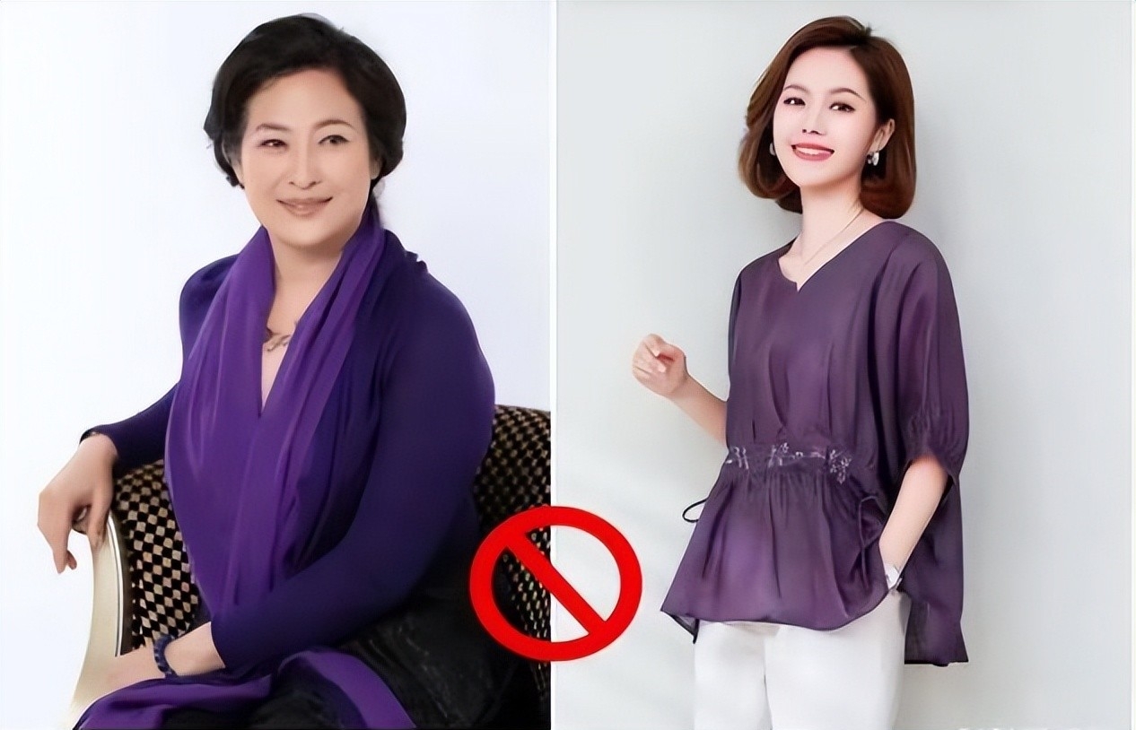
Dark purple – The color that makes you look older than your age
Dark purple is often considered the color representing middle-aged women, but it does not flatter the skin, easily creating a feeling of stiffness and outdated. Compared to dark purple, colors such as cobalt blue or pastel purple will help you look more elegant and noble. When combined with materials such as chiffon or chiffon, dark purple makes the overall outfit look cheap and cheap, so you should limit your choice of this color.
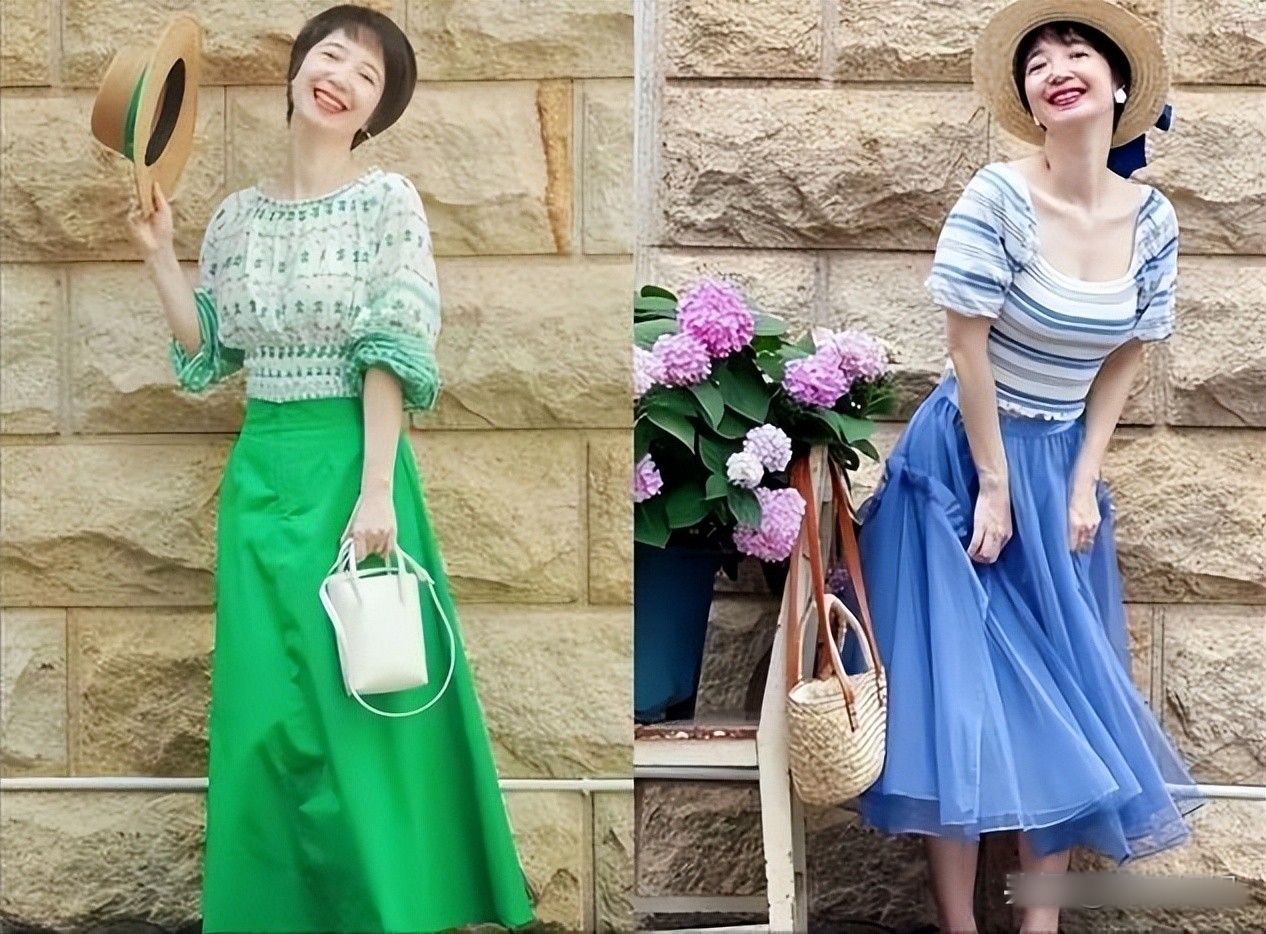
Fluorescent green, bright green
Many middle-aged women like to choose blue or green because they think that cool tones will help them look younger. However, blue tones that are too bright or too dark often make the overall look cold and distant, reducing the softness and femininity of women.
Moreover, these colors often feel like stage costumes, difficult to match and easy to go out of style. Instead, try elegant blue tones like denim blue, pearl blue or pastel blue, which are both trendy and easy to match.
Colorful floral patterns – Makes the body look heavy and less graceful
Outfits with small floral patterns combined with many bright colors such as red, green often create a confusing and unsophisticated feeling. Even if you choose a neutral background like black, white or gray, these patterns still make the overall look less classy, older and reveal body flaws.
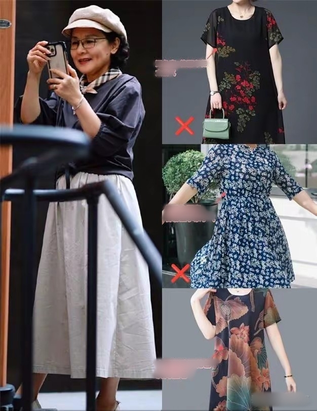
Small, dense patterns tend to make the wearer look fuller. Instead of choosing colorful floral patterns, prioritize minimalist patterns, light colors such as flowers on a pastel background or monochrome patterns, to help the overall look look more youthful and elegant.
Wearing all hot colors – Easily makes you feel old-fashioned and rustic
Do you think wearing the same color is a “safe” rule for coordinating outfits? Not really! Especially if you choose warm tones like skin pink or earthy orange, the overall look will look less trendy, lacking highlights and even somewhat outdated.
Nowadays, fashion experts no longer encourage the way of matching a whole set of one color, especially with colors that are too "girly" or too close to skin color, because they easily create the feeling of trying to "pretend to be young" or lose the necessary elegance.

If you love warm colors, use them as accents instead of covering the whole outfit. Colors that are too light or too hot should only appear in accessories such as handbags, scarves, shoes, and should not be used for the whole outfit.
Fashion color matching principles help elevate style
Use a bright color as an accent
In an outfit, choose a bold color accent, especially on the upper body (from the waist up) to create a focused effect, elongating the legs. For example, a burgundy or navy crop top will create attraction, while keeping the overall outfit more elegant and light.
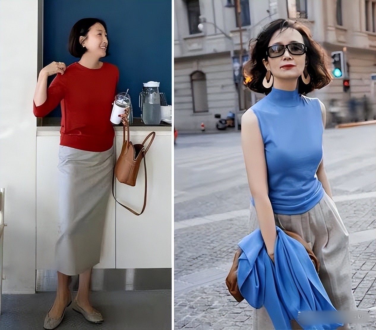
Bright colors should be avoided near the face, use neutral colors as transition colors
Bright, bold colors should be avoided because they can reveal skin imperfections. Bright colors can be used to create highlights, but should be combined with neutral colors such as gray, beige, and white to soften the overall look, making the skin look more harmonious.

Spring 2025: Colors Middle-aged Women Should Try
Rose Pink & Royal Blue
Rose Pink: This is a pink-red tone, giving a more charming and luxurious look than baby pink. This is the perfect choice for women over 40 who want to wear pink but still maintain elegance. Royal Blue: This blue has a natural elegance, flatters the skin very well, helps neutralize yellow pigments on the skin, making the face look brighter and younger.
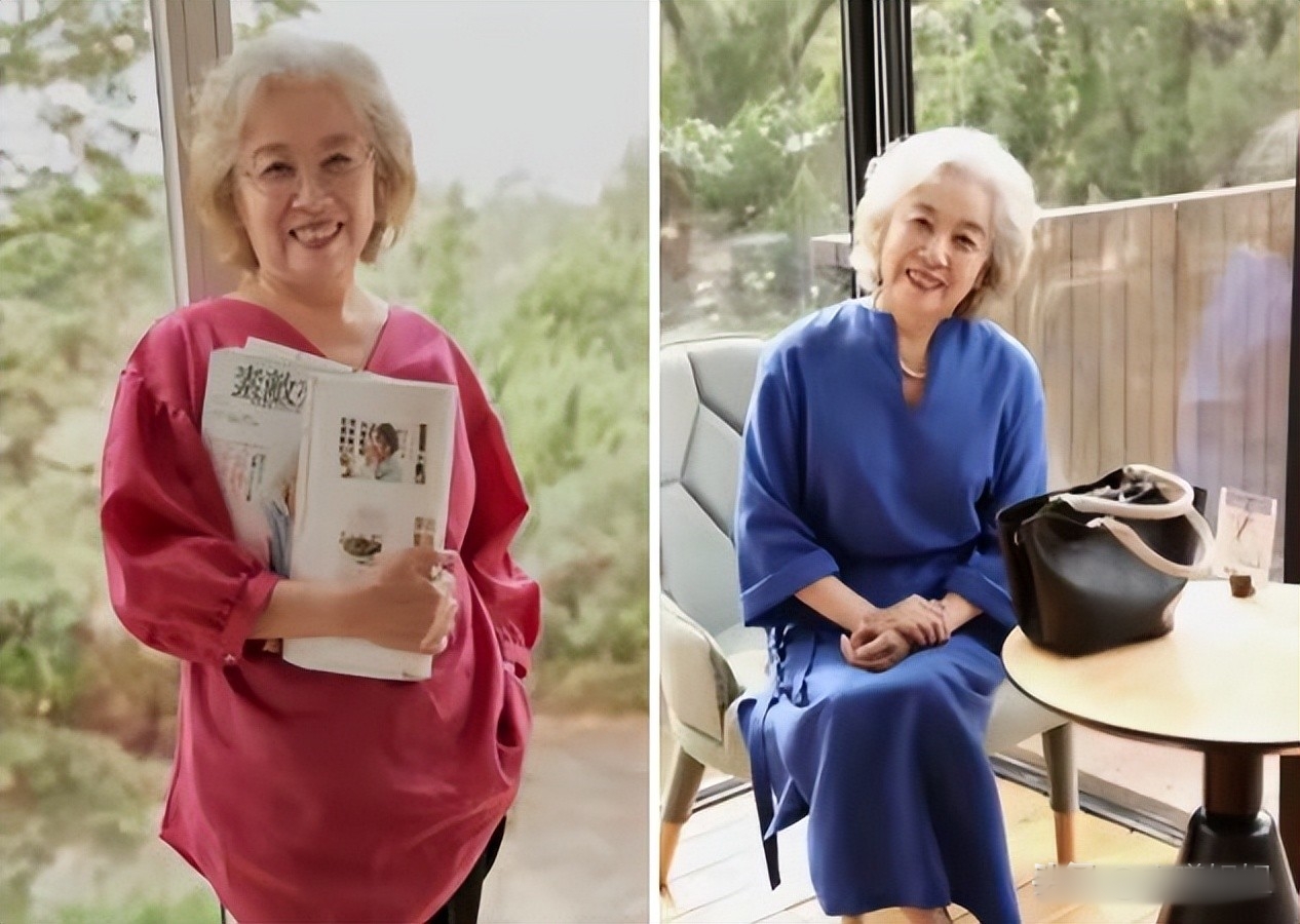
Neutral Charcoal Grey – A Subtle Alternative to Pure Black
Although pure black is a basic color, if not skillfully coordinated, it can make the overall outfit look old and lacking in highlights. Especially when applied to many different types of materials, black does not really highlight the wearer's personality.
Instead, try charcoal gray – the perfect combination of black and gray that creates a luxurious yet versatile and youthful look.
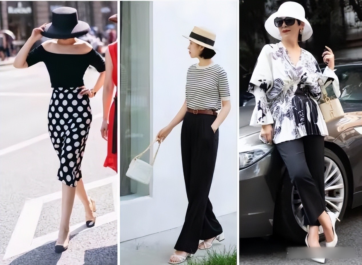
When used for outfits that need a slimming effect such as dark pants or skirts, charcoal gray gives a neat feeling without being too heavy, helping you look slim but still fashionable.

Using bright and outstanding colors will help you avoid the disadvantages of choosing a color tone that is too close to your skin tone, creating a contrasting effect that helps to flatter your skin and highlight your aura. Colors that have a slight contrast to your skin tone help to bring out your vitality, avoiding the situation where the color is submerged or makes the overall outfit look pale and lacking in highlights. Combining colors with a reasonable level of contrast helps to create elegance and attraction without being too dazzling.
Source: https://giadinh.suckhoedoisong.vn/phu-nu-trung-nien-nhat-dinh-dung-chon-trang-phuc-gam-mau-nay-vi-vua-kem-sang-lai-que-mua-172250313085303556.htm
















Comment (0)